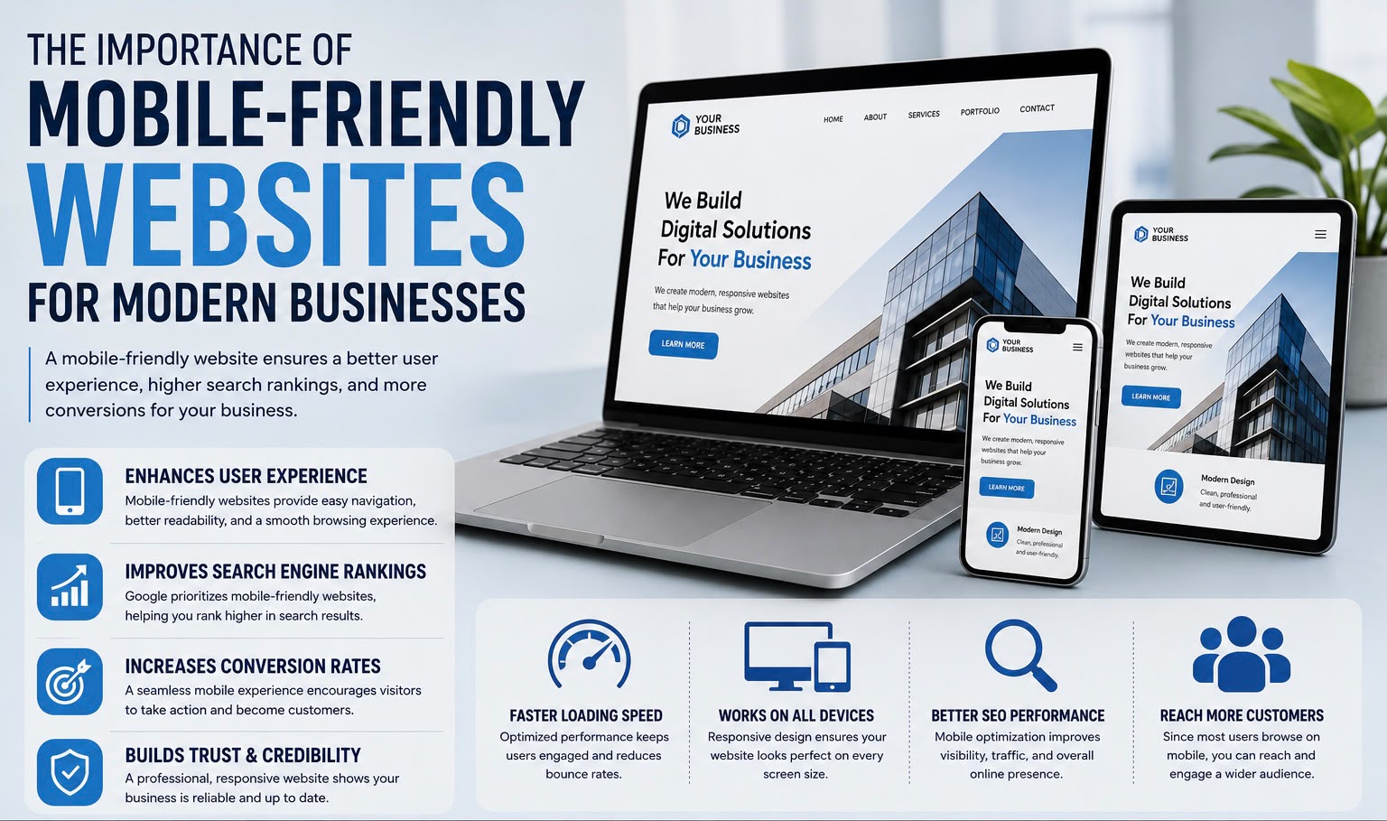
Today, most people browse the internet using their smartphones. Whether they are searching for products, booking services, or reading information, users expect websites to load quickly and work perfectly on every screen size. A mobile-friendly website is no longer optional—it’s a necessity for businesses that want to attract and retain customers.
What Is a Mobile-Friendly Website?
A mobile-friendly website automatically adjusts its layout, images, and content to fit different screen sizes, including smartphones and tablets.
Users can easily navigate the website without zooming, scrolling sideways, or struggling to click buttons.
Enhances User Experience
Visitors are more likely to stay on a website that is easy to navigate on mobile devices.
Responsive layouts, readable text, and touch-friendly buttons create a smooth browsing experience that keeps users engaged.
Improves Search Engine Rankings
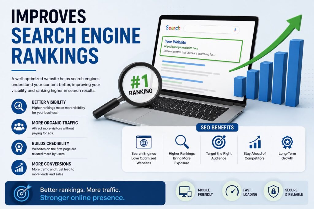
Search engines prioritize mobile-friendly websites because they provide a better experience for users.
A responsive website can improve your visibility in search results and help attract more organic traffic.
Increases Conversion Rates
When customers can easily browse products, complete forms, or make purchases on their phones, they are more likely to take action.
A mobile-optimized website removes barriers that often lead to abandoned visits.
Builds Trust and Credibility
A modern, responsive website shows customers that your business is professional and up to date.
Visitors are more confident doing business with companies that provide a seamless digital experience.
Supports Faster Loading Speeds
Mobile-friendly websites are typically optimized for performance.
Faster loading pages reduce bounce rates and improve customer satisfaction, especially for users on mobile networks.
Why Choose Professional Responsive Web Development?
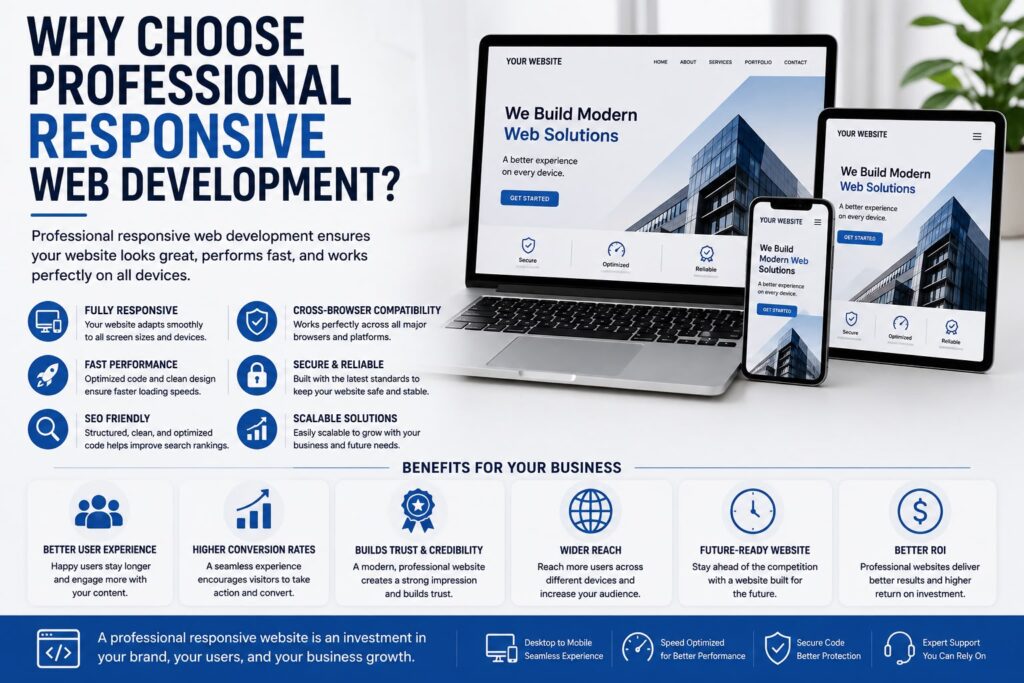
Professional developers ensure:
- Fully responsive layouts
- Fast page loading
- SEO-friendly structure
- Cross-browser compatibility
- Secure and scalable development
- Optimized user experience on all devices
This ensures your website performs reliably across desktops, tablets, and smartphones.
Conclusion
A mobile-friendly website helps businesses reach more customers, improve search rankings, and deliver a better user experience. As mobile usage continues to grow, investing in responsive web development is essential for long-term online success.
At Debuggers, we build responsive, high-performance websites that look great and function flawlessly on every device, helping businesses grow in today’s digital world.