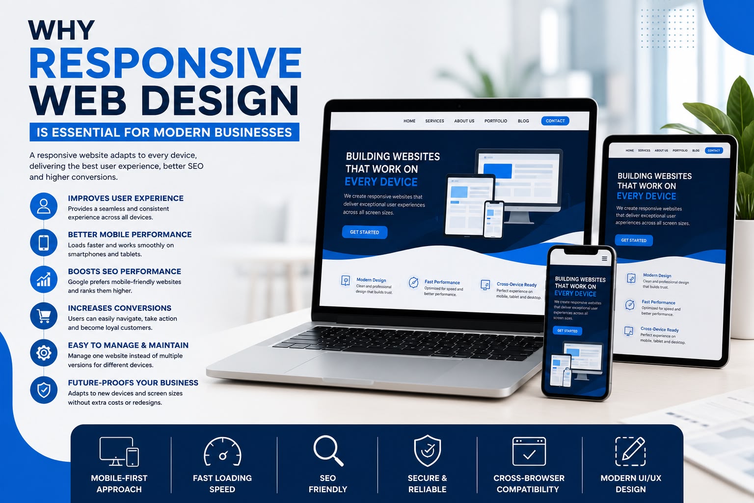
Today, people access websites from smartphones, tablets, laptops, and desktop computers. If your website doesn’t adapt to different screen sizes, visitors are likely to leave and choose a competitor instead.
Responsive web design ensures your website looks and functions perfectly on every device, creating a seamless experience for users while improving search engine performance.
What Is Responsive Web Design?
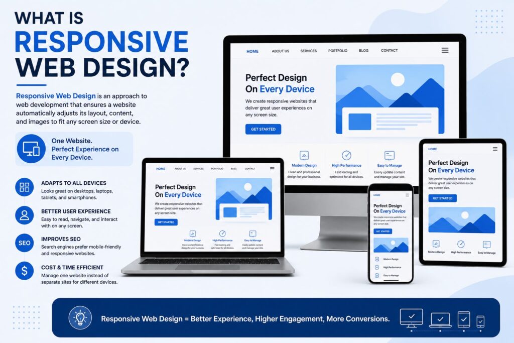
Responsive web design is an approach to website development that automatically adjusts layouts, images, and content based on the user’s screen size.
Instead of creating separate websites for mobile and desktop users, one responsive website delivers an optimized experience across all devices.
Improves User Experience
A responsive website makes navigation easier by displaying readable text, properly sized images, and user-friendly menus on every device.
Visitors can quickly find information without zooming or excessive scrolling, leading to higher engagement and customer satisfaction.
Better Mobile Performance
With mobile users making up a significant portion of internet traffic, businesses must ensure their websites perform well on smartphones.
Responsive websites load efficiently, offer smooth navigation, and provide a better browsing experience for mobile visitors.
Supports Higher Search Engine Rankings
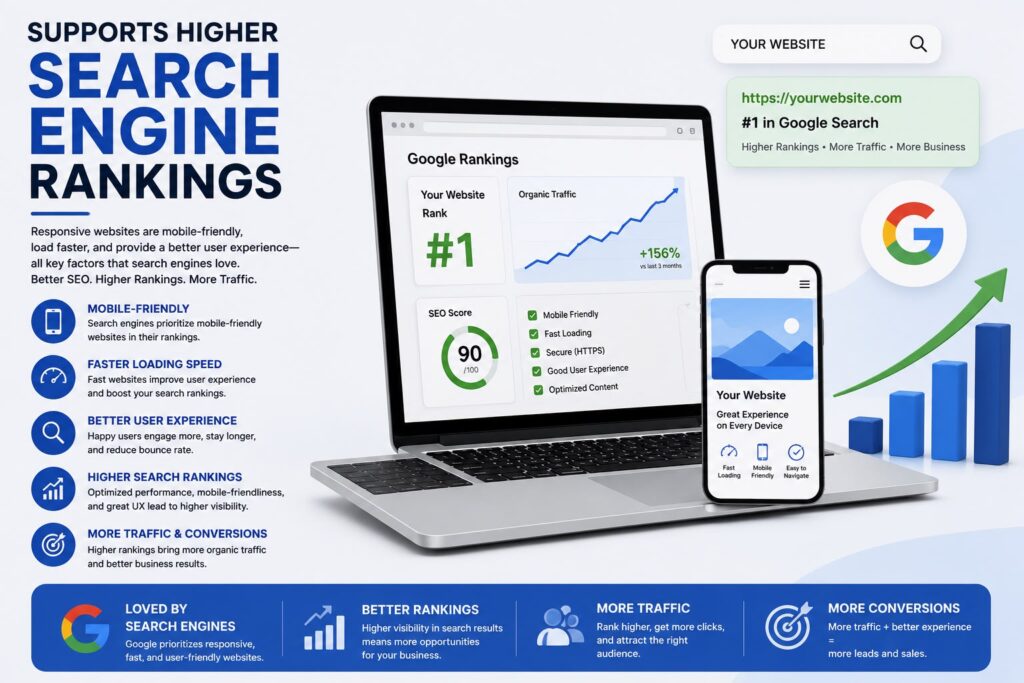
Search engines prioritize mobile-friendly websites when displaying search results.
A responsive design improves usability, page performance, and technical SEO, helping your website achieve better visibility and attract more organic traffic.
Increases Conversion Rates
When visitors can easily browse products, complete forms, or contact your business from any device, they are more likely to become customers.
A responsive design removes barriers that often prevent users from completing important actions.
Reduces Maintenance Costs
Managing separate desktop and mobile websites requires more time and resources.
A single responsive website is easier to update, maintain, and optimize, saving businesses both time and development costs.
Future-Proof Your Business
New devices and screen sizes continue to emerge every year.
Responsive web design ensures your website remains compatible with modern technology without requiring major redesigns whenever new devices become popular.
Why Choose Professional Responsive Web Development?
An experienced development team ensures your responsive website offers:
- Mobile-first design
- Fast loading speed
- SEO-friendly structure
- Cross-browser compatibility
- Secure development practices
- Modern UI/UX design
Professional development guarantees your website delivers a consistent experience for every visitor.
Conclusion
Responsive web design is no longer optional—it is essential for every modern business. A mobile-friendly website improves user experience, supports SEO, increases conversions, and keeps your business competitive in today’s digital landscape.
At Debuggers, we build responsive, high-performance websites that look great on every device while helping businesses grow with modern web technologies.